
204 Hoxton St
A sympathetic building regeneration
With an incredible location on offer, I worked with the property developer to create an identity and visual system for this soon-to-be iconic building in the heart of Hoxton. The aim was sympathetic regeneration of this listed building, and to create affordable luxury for London residents looking to buy their second home.
My role
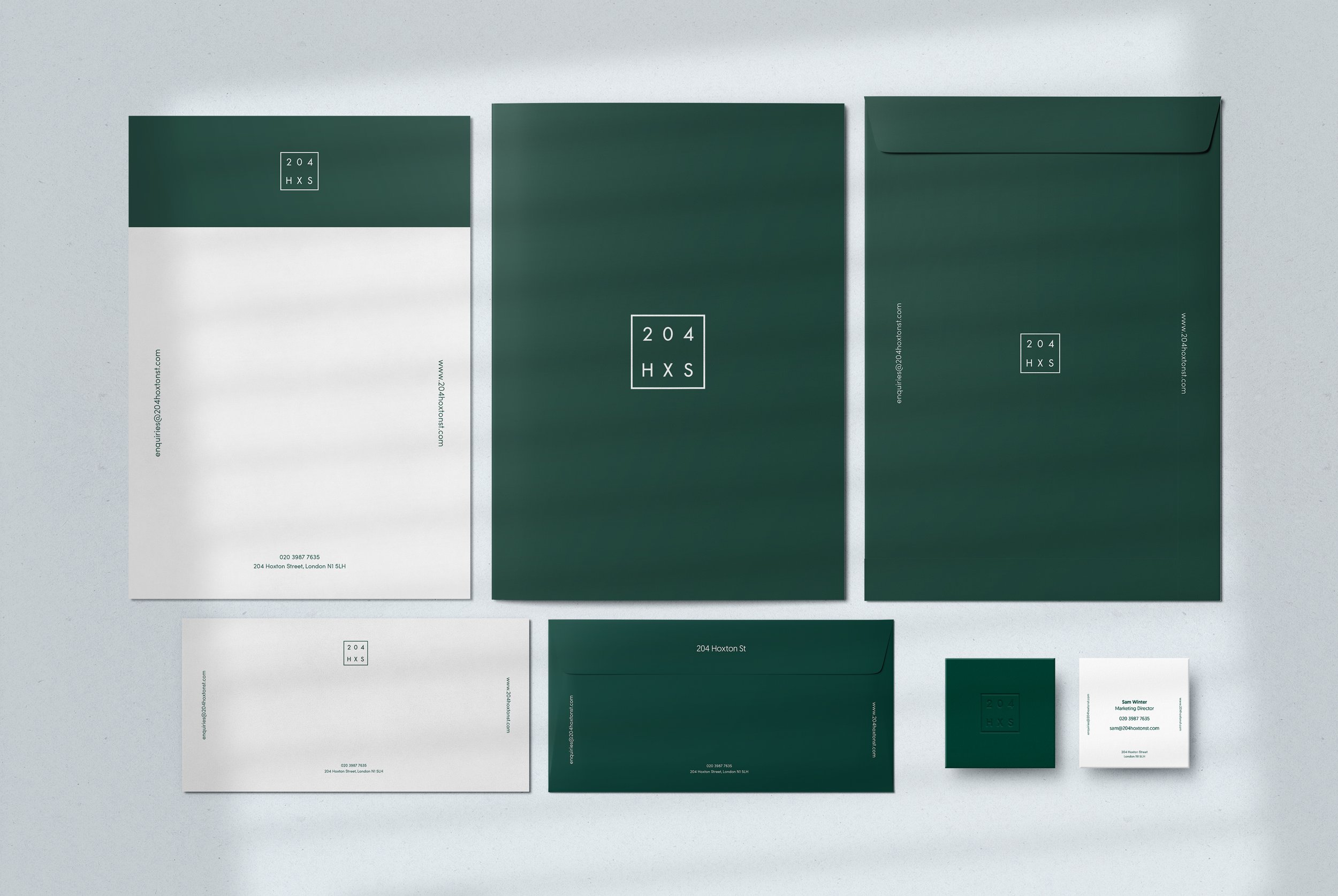
I worked with the property developer to create a brand identity for a building they were refurbishing into luxury apartments, in the heart of Hoxton. I produced the logo, colour system, and visuals for stationery.
I worked on
Brand Strategy
Brand Identity + Design System
UX/UI Design


The design system
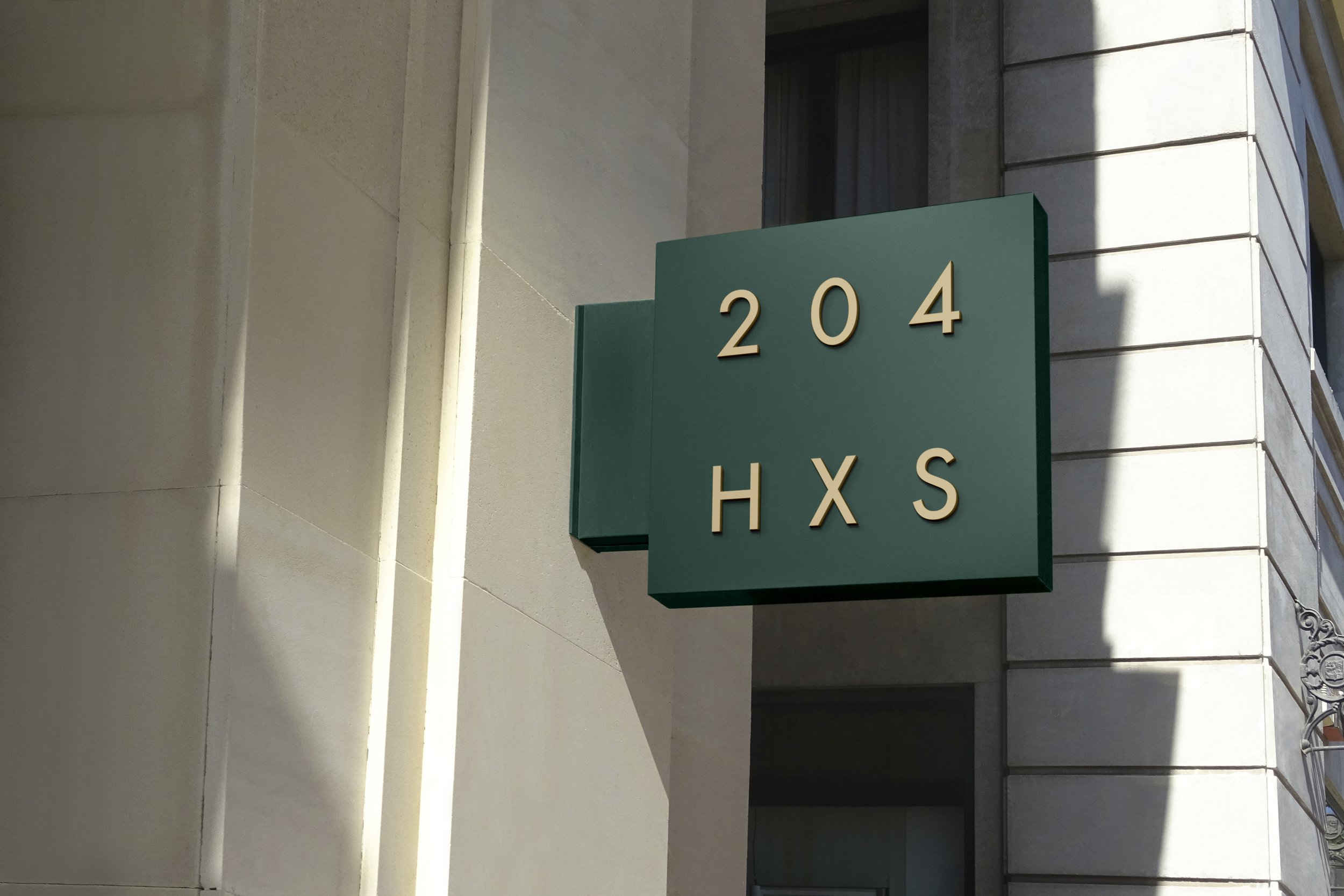
The logo
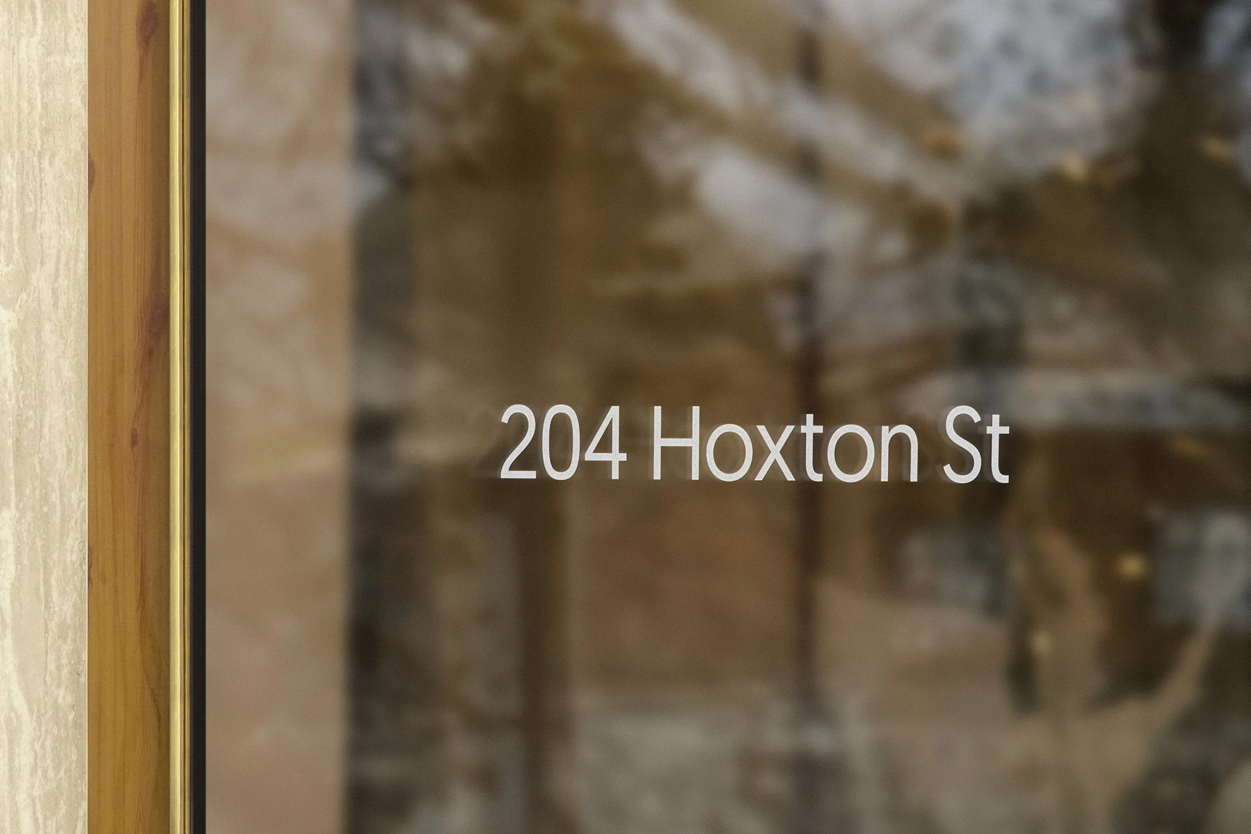
The iconic address was used to create a contemporary emblem, that references architecture from a plan perspective. The square references the 4 walls of a building that give a home to the letters of the address. It is also used with the full address typed out, where necessary.
Colours & typography
Deep green became the primary colour, referencing sympathetic regeneration and obtainable luxury. We offset the green with some salmon highlights in the digital space, while the print and signage world would remain clean and green.
Fonts are not fussy, minimal and clean.
Photography & visualisations
Interiors images shown in the web mockups are digital renders or mood images just as placeholder, as and at the time of the project the building was under construction. The plan was to get some beautiful photography done once the site was finalised.
Other work
Creature Comforts
Rebuilding the vet experience from the ground up

Givestar
High-impact tech for good causes everywhere
Nicoya
Empowering men and women to invest in the longevity of their skin health