Manual
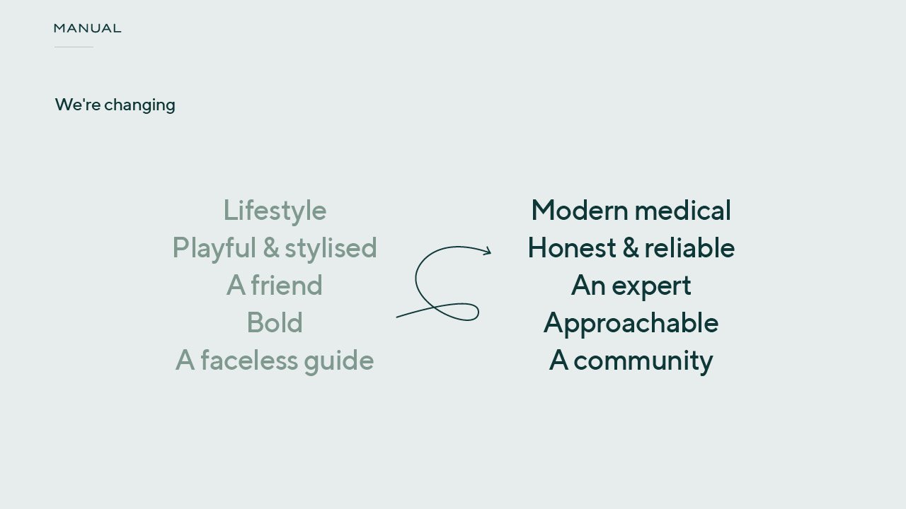
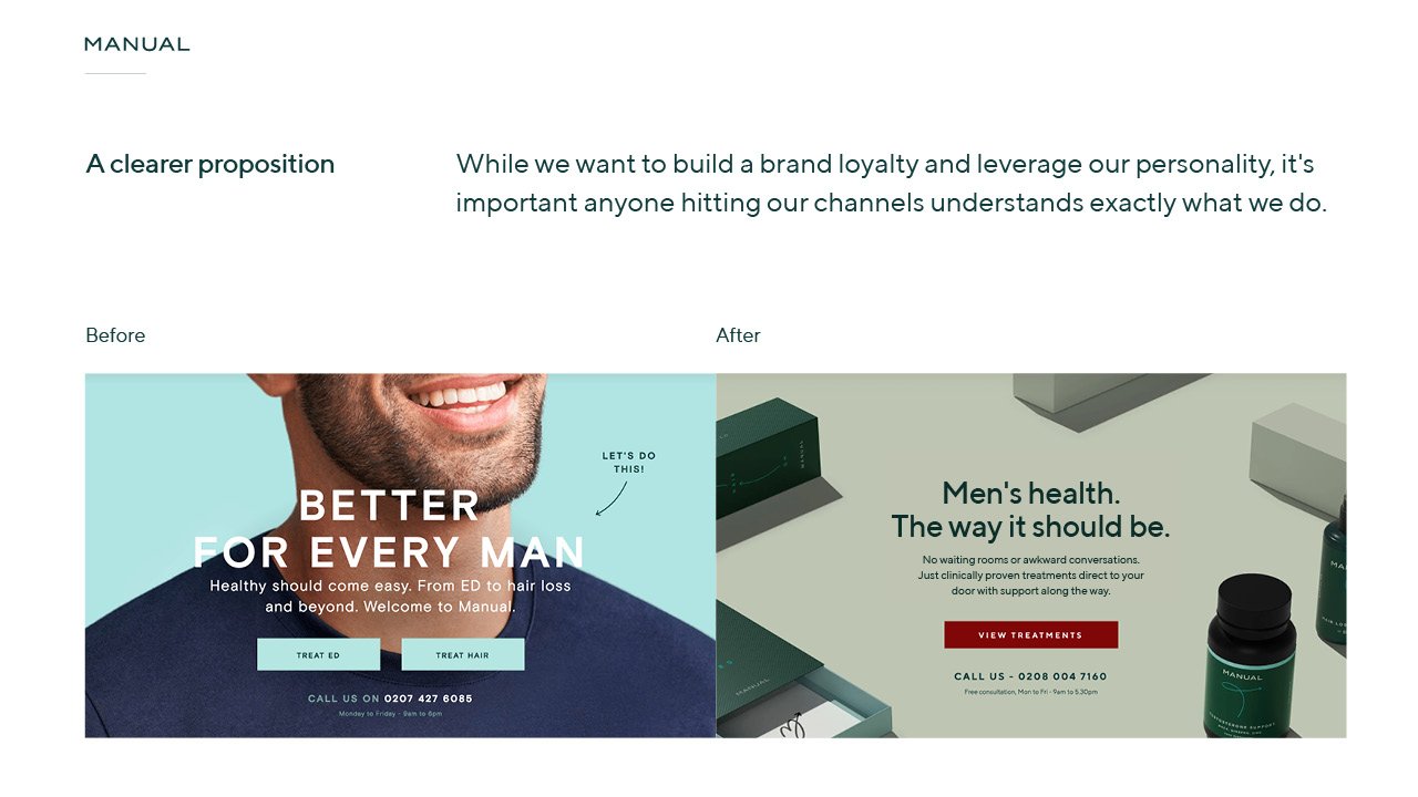
A rebranding project for a men’s health website, with the aim to appeal to more mature audience and better promote their medical and trusted credentials.
manual.co
Before the rebrand
Nearly 90% of men don’t seek medical help unless they have a serious problem. That stat sucks.
The vision for Manual is that it inspires men across the globe to no longer brush their issues under the carpet and get support on their journey. digital healthcare
No waiting rooms or awkward conversations, just clinically proven treatments direct to your door - with your choice of support along the way. It’s modern medical for men.
*Some images seen in mockups below are references grabbed online, and were not shot for the company.
My role
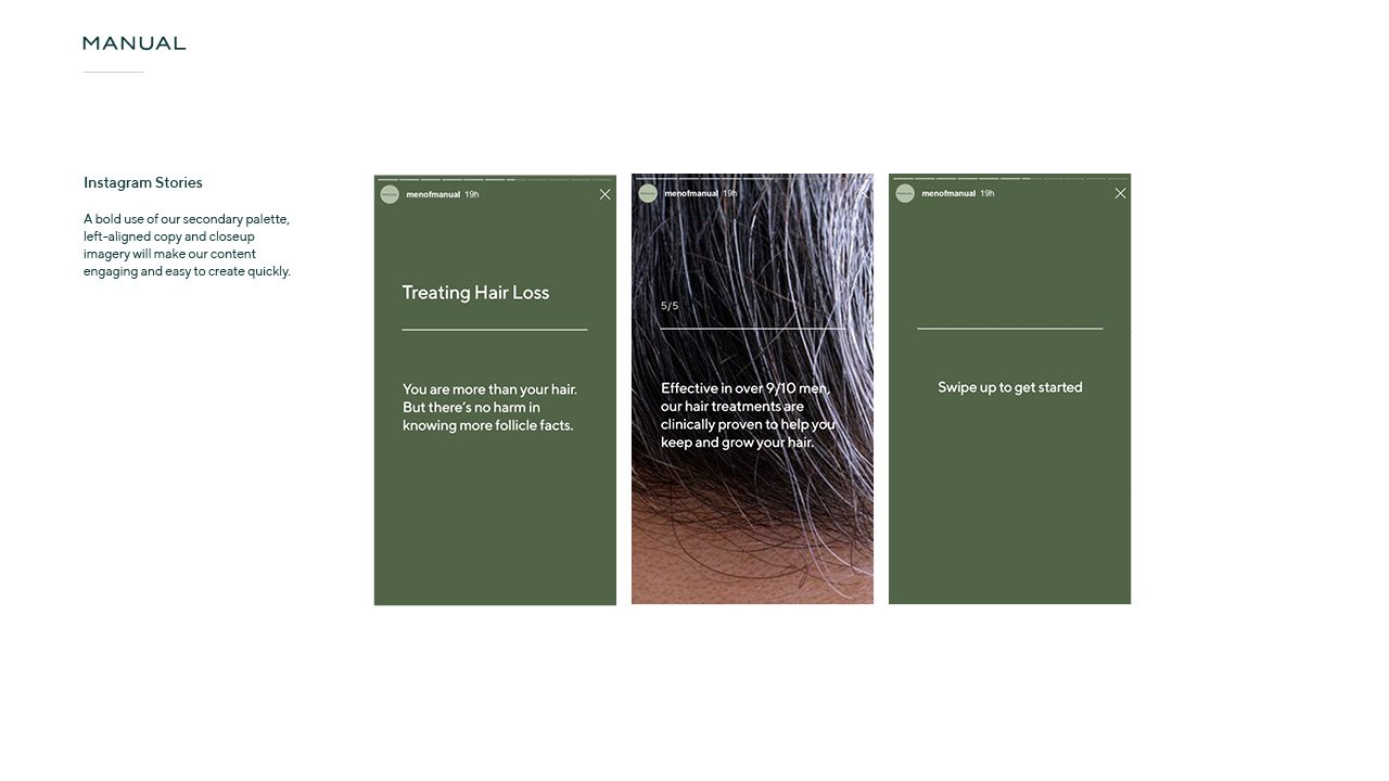
Manual were halfway through a rebranding project when I joined - with the aim to complete the project. I spent 3 months with the team on a part-time basis, to tweak the design system and explore the photography guidelines. I firstly completed the brand guidelines, in order for the product designer to design the new digital experience. We then worked with an illustrator, Jonathan Mayes, to create custom animations and icons, and with a visualisation agency to create renders of the products. I then created a suite of emails, new packaging designs, and new templates for Instagram - all based on the guidelines.
I worked on
Brand refinement / design system creation
Brand guidelines
Packaging (visuals)
Illustration Direction
Email
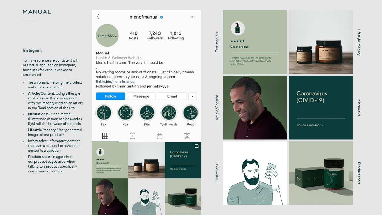
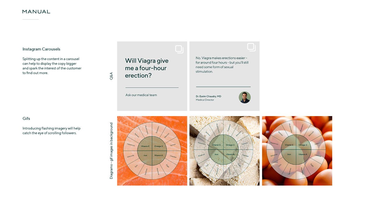
Organic social


The design system
Logo
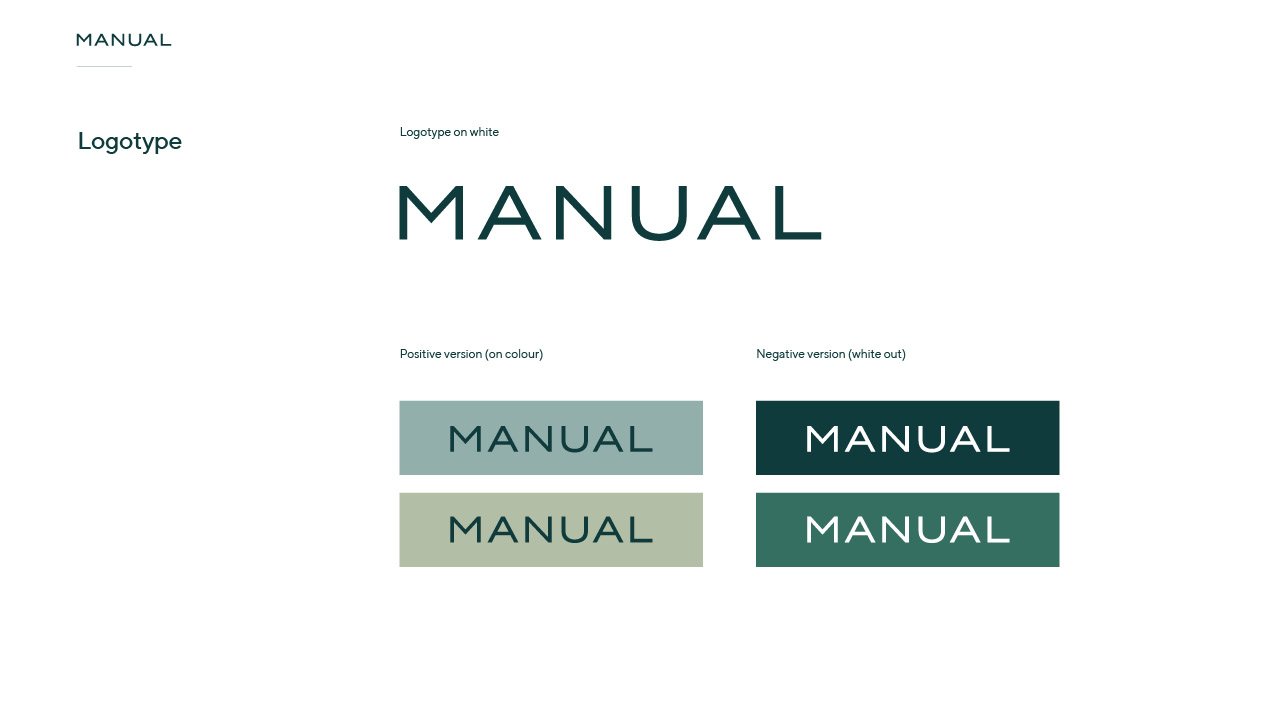
The logo was inherited from the previous brand, so no changes were made here, apart from choosing to use the logotype more often than the logomark.
Colours & typography
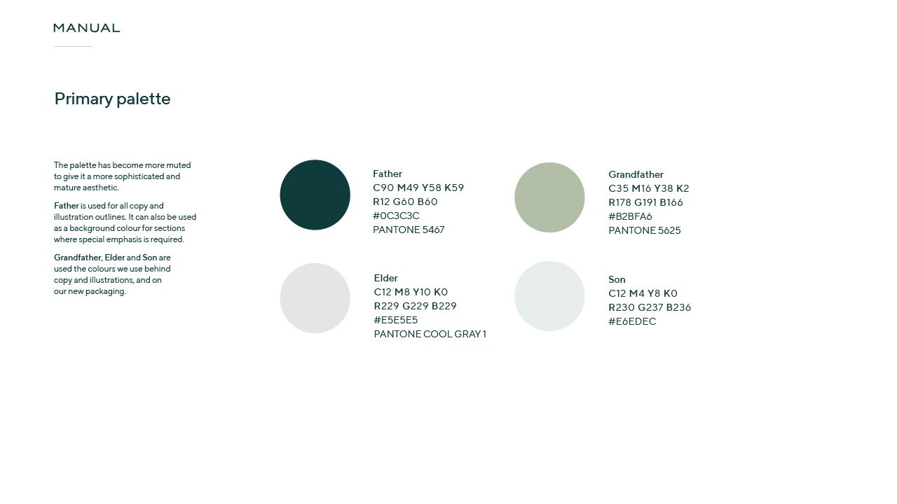
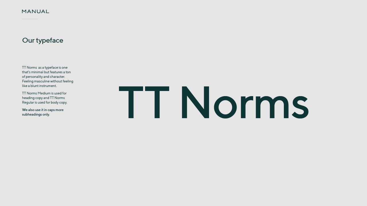
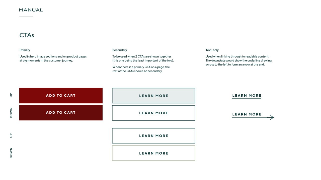
The colour palette included a selection muted tones of blues and greens - colours synonymous with the NHS. The colours feel familiar and trustworthy, especially to the UK market, are are seen in many medicinal brands and products. The muted nature of the the colours take the palette to a more sophisticated, mature place, and the addition of a warm maroon accent balances all of the cooler tones.
Illustration & photography
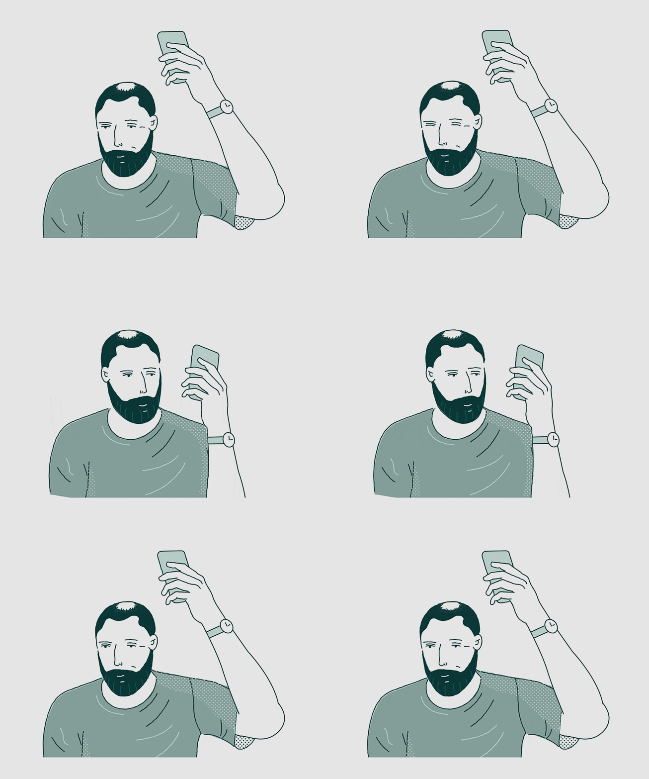
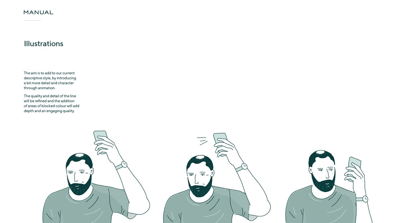
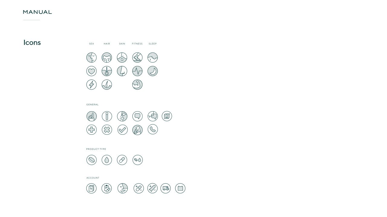
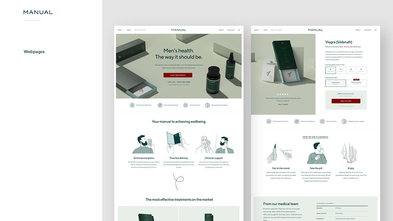
I proposed an illustration style to work with the design system, which is derived from a classic infographic line style and combined with modern animation. The style aims to be approachable and informative, but not too quirky for a mature audience.
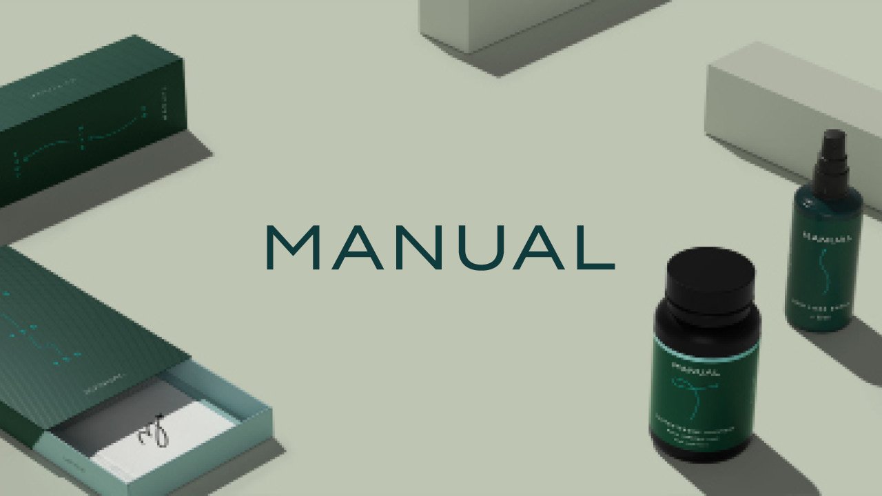
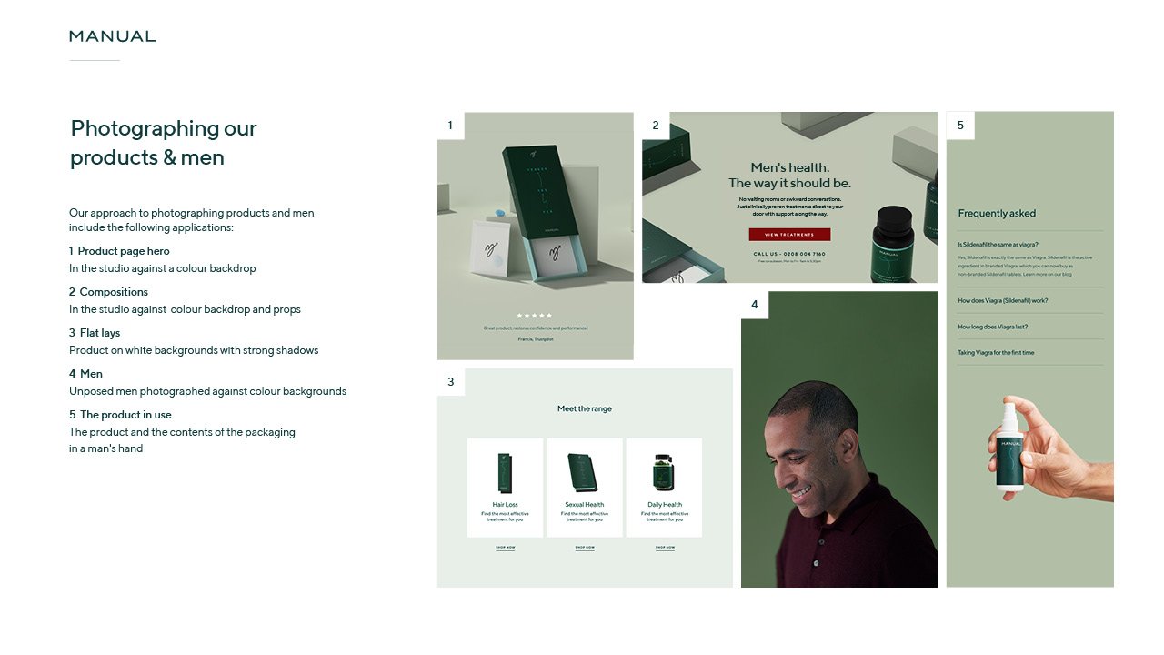
Product photography references include products on colour backgrounds, and using the product packaging as props.
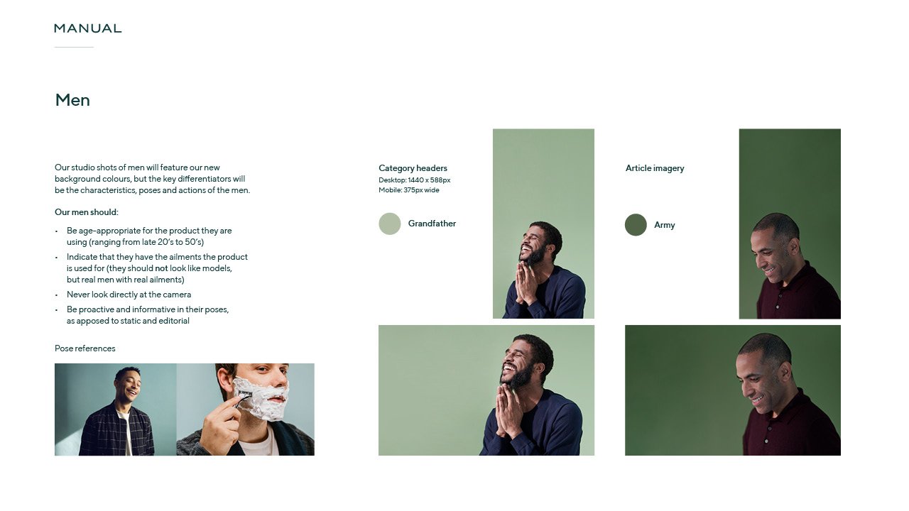
Brand photography references featured men on colour backgrounds or in natural settings. The featured men are real, unposed and inclusive of all ages. Although references show younger men, the actual imagery would never feature models, but real men of appropriate age.
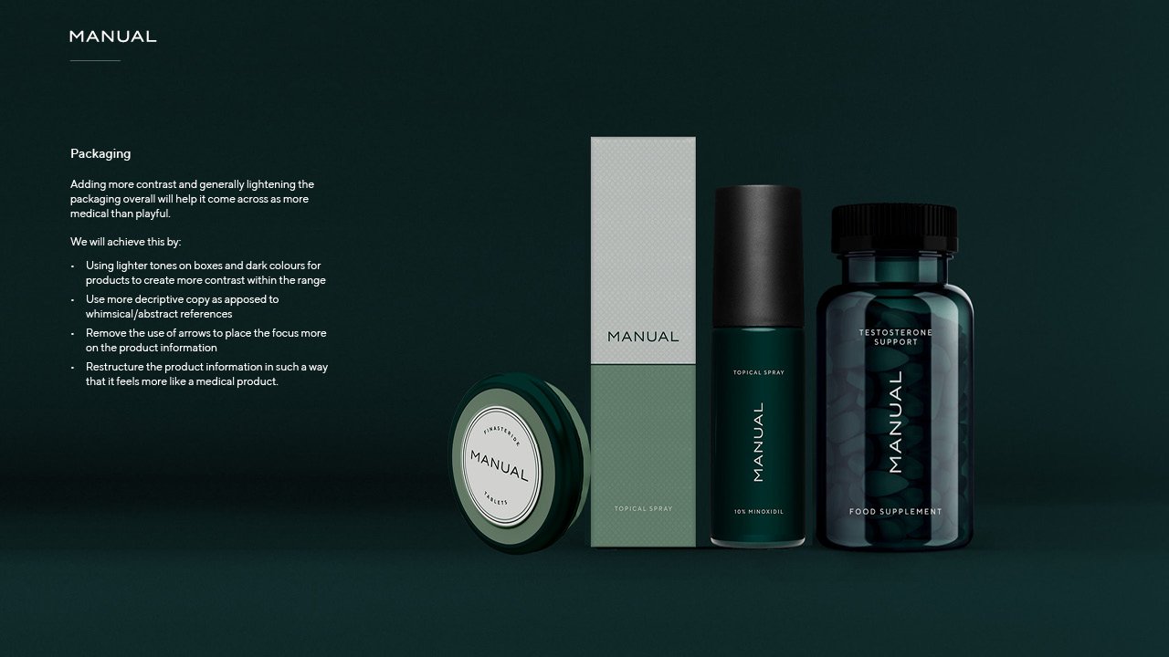
Some imagery below contains the old packaging, but I created a new direction for the packaging designs as well.



Other work
204 Hoxton St
A sympathetic building regeneration
Hang
Making the process of online framing easy, affordable and special
Paws
Be the amazing pet parent you want to be


